Sample seed pitch deck: CulturePulse’s $1M deck

Sentiment analysis, which means generalizing a feeling expressed by people in, say, online reviews, has been around for a hot minute. It’s a powerful feedback and quantitative analysis tool with wide-ranging political, commercial and social applications.
Slovakian company CulturePulse recently raised just short of a million dollars to move the needle further in this area. The company’s pitch deck is bad enough that I’m surprised it raised money, so let’s take a look at why that is and what could be improved.
We’re looking for more unique pitch decks to tear down, so if you want to submit your own, here’s how you can do that.
Slides in this deck
The company submitted its deck to us a couple of months ago, claiming that this terse, nine-slide presentation is what it used to pitch to VCs. It comprises of the following slides:
- Cover slide
- Solution slide
- Product slide
- Business model slide
- Customers and media slide
- Roadmap slide
- Team slide
- The ask slide
- Closing slide
Three things to love
I’m not going to lie: I really struggled to find three things I truly love about this deck. That said, here are a few things that stood out:
The solution space
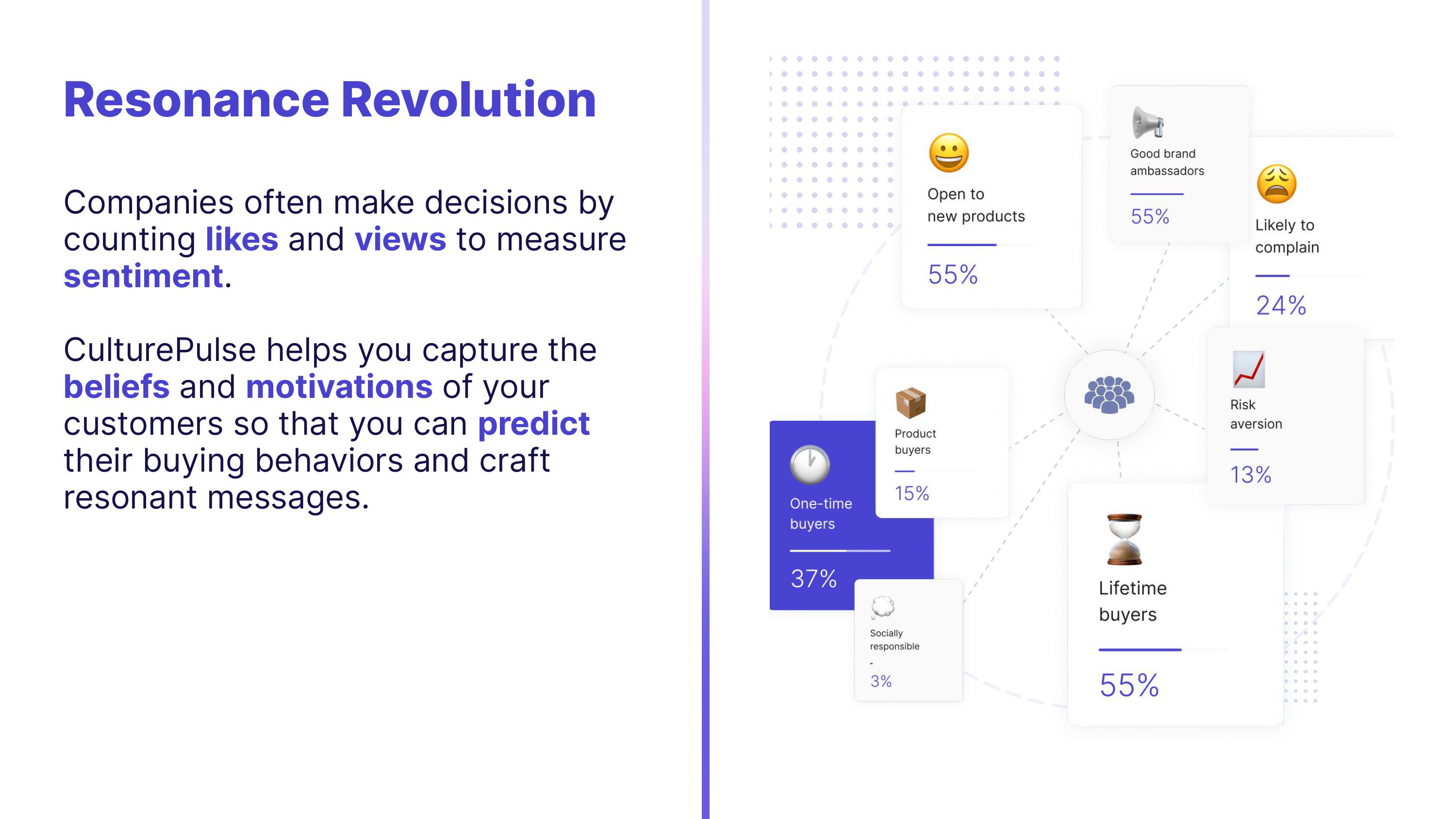
The deck doesn’t have a problem slide per se, but this one passes as a combined problem/solution slide:

[Slide 2] CulturePulse’s combo problem/solution slide. Image Credits: CulturePulse
As much as I would have preferred a separate problem slide, this sort of works. On the left, it outlines the problem (presumably, that without CulturePulse’s product, it’s hard to capture the beliefs and motivations of customers) by stating what the solution does.
The part I really do like about this slide, though, is the illustration on the right: It shows some of the potential motivations that customers might have. For even better results, the company could have connected the dots with something like: “We enable you to spend more time focusing on your lifetime buyers than your one-time customers.” But the slide works as-is.
Cracking opening

[Slide 1] Powerful opening slide. Image Credits: CulturePulse
“Show, don’t tell,” is one of the cornerstones of effective storytelling. “Make your message resonate,” combined with the product screenshot on the right is a great way to set the stage for an investment conversation. I particularly like the “resonance score” on the right — if it works, being able to test a bunch of copy to see what the AI believes will work best for the target platforms and audiences would make for a very smart approach.
I don’t like how this slide doesn’t take the audience into consideration: “Your” speaks to investors, and while there are investors on social media who might wish to use this product, they are probably not CulturePulse’s core audience. It’s needlessly confusing to have a “you” on a slide that’s talking to investors when it means your customers.
Great final thought
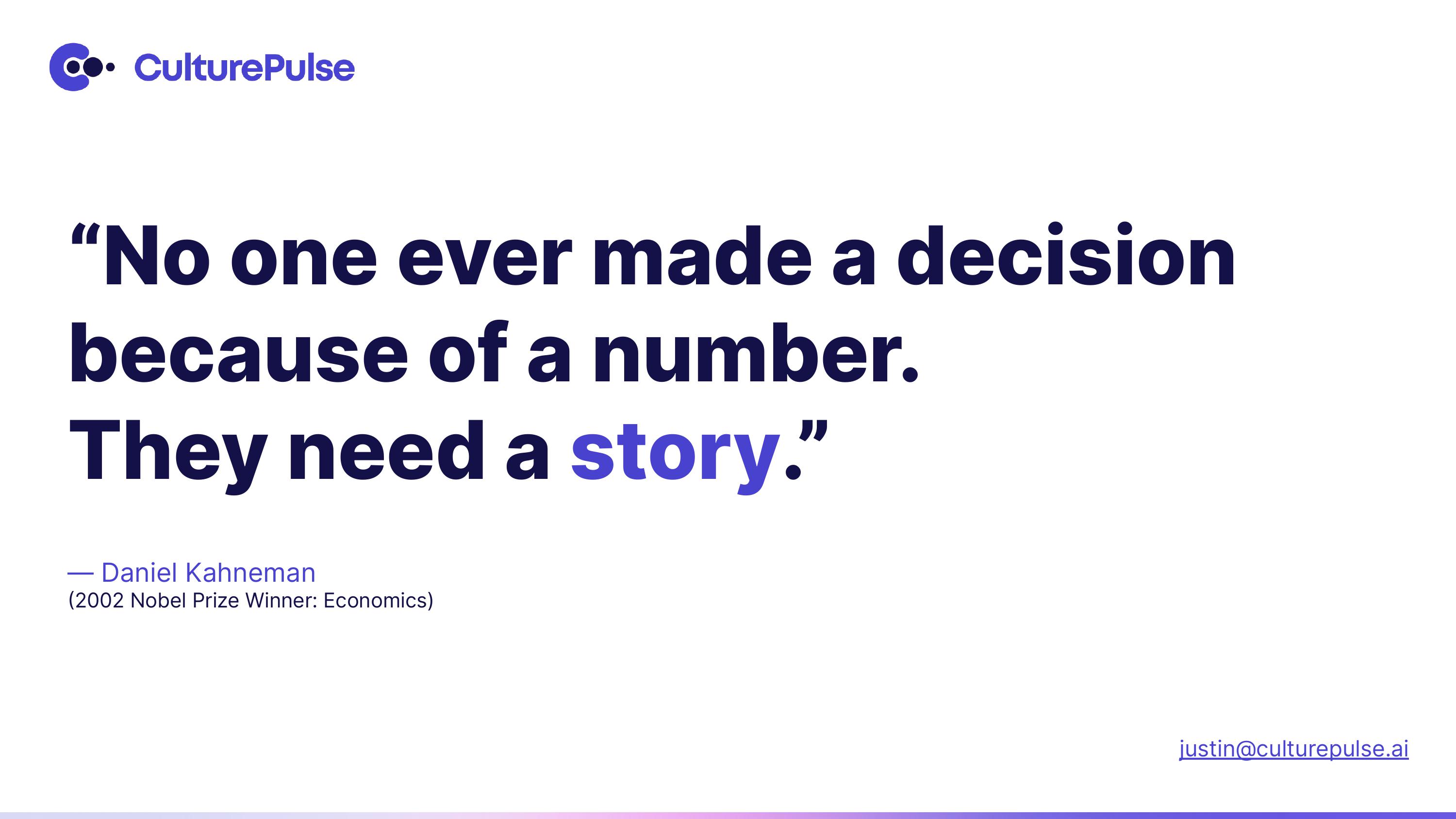
The deck closes with a poignant quote:

[Slide 9] Leave ’em on a high. Image Credits: CulturePulse
It’s a fantastic idea to give your would-be investors something to ponder at the end of a presentation. A quote from an economics Nobel Prize winner that essentially describes your business is as good a way to close as any. Very well done.
In the rest of this teardown, we’ll try to limit the things CulturePulse could have improved or done differently to just three things. Its full pitch deck is also included!


