A closer look at Apple’s $3,499 Vision Pro headset
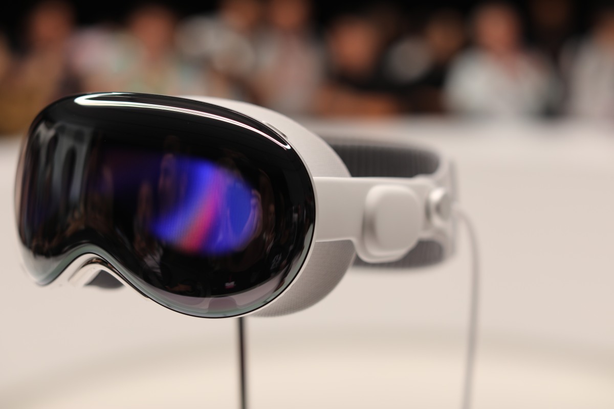
There are books left to be written of the good and bad of Apple’s leap into the world of augmented reality hardware. We’ll no doubt still be gathering our thoughts for some time, but one thing is clear: This is a well-designed machine. Sitting there on a well-lit post, surrounded by a scrump of international reporters, the Vision Pro looks pretty cool.
Not sure what exactly I was expecting after today’s keynote, but when you get right in front of it, the industrial design is undeniable. It’s an impressive feat of engineering, even if the actual execution of product and experience is not entirely clear. This is likely the most we’re going to get for a bit. Keep in mind, the product is coming next year, and the company is very focused on developers at the moment.

Image Credits: Brian Heater
The design language clearly takes more than a few design cues from Apple’s own AirPods Max line, especially in terms of the band. The front glass, on the other hand, is something altogether new for the company. Without any apps running currently, it’s a bit of a black void, with swirling colors, not unlike the design you get on the top of the HomePod.

Image Credits: Brian Heater
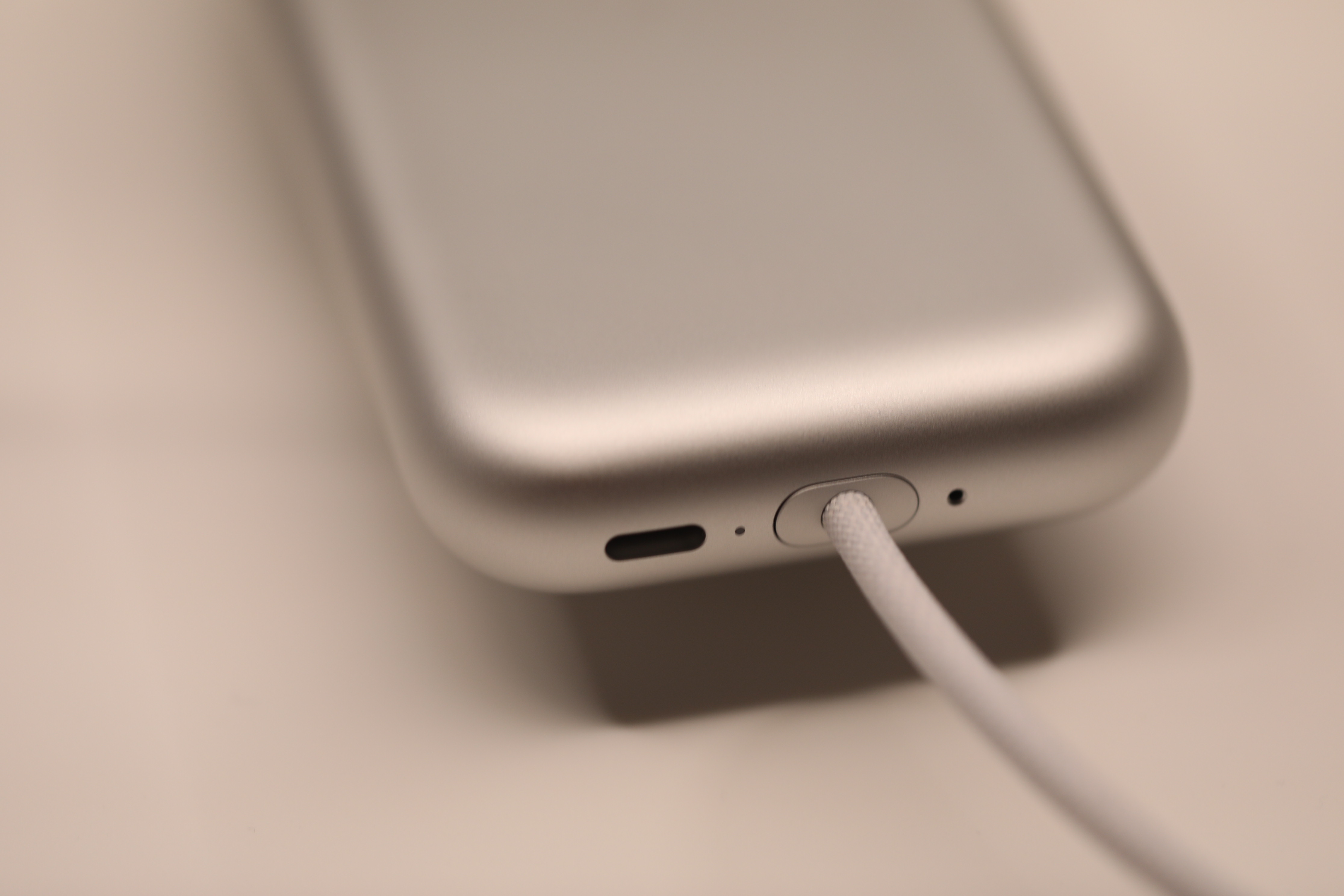
I will say with some relief that the external battery pack is small enough to fit in the wearer’s pocket. It’s shorter but thicker than an iPhone. Obviously no external battery pack is the best external battery pack, but the company needed to get a system that operates for at least a couple of hours on a charge.
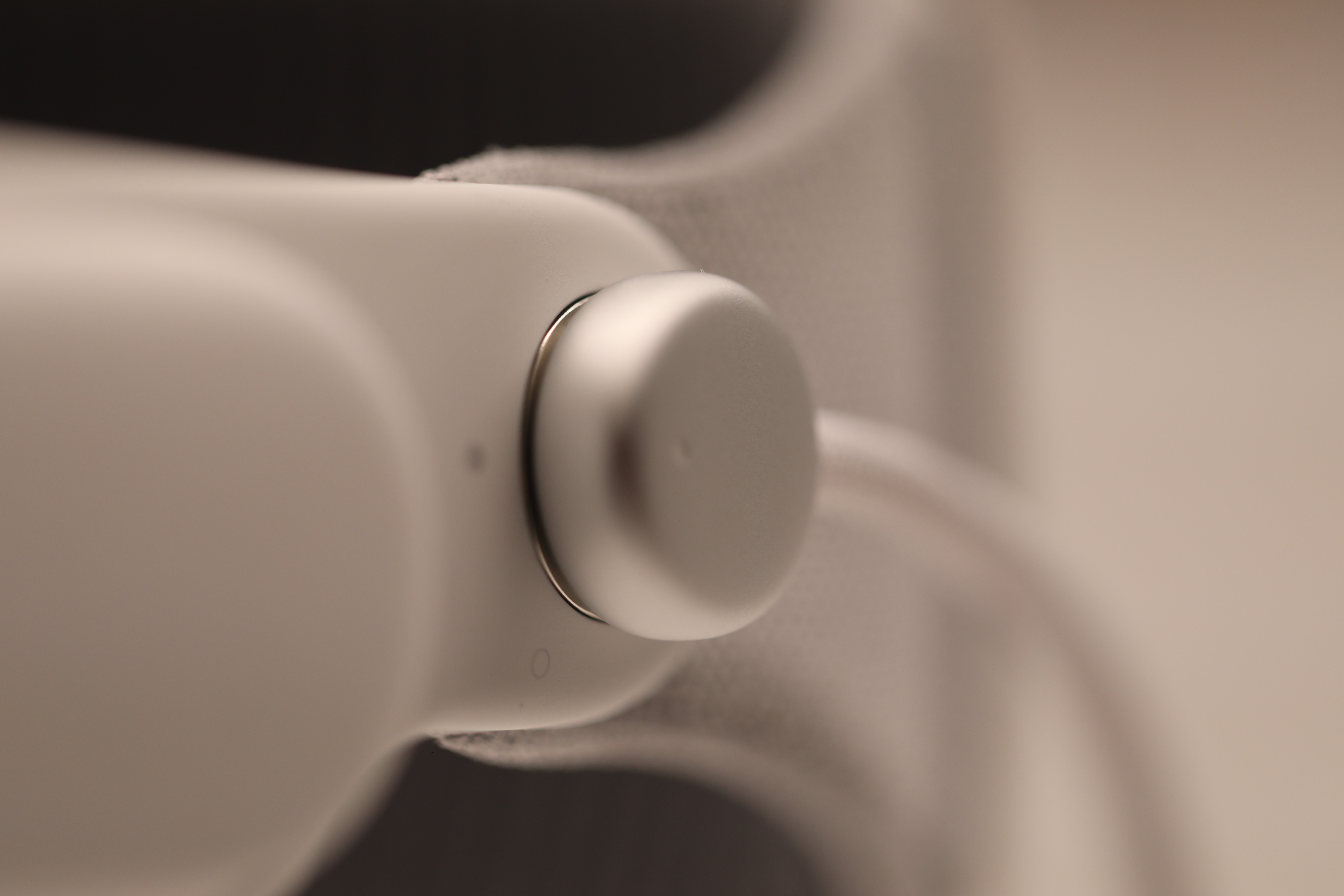
The digital crown is a bit larger than I’d anticipated — though you do need a bit of size when fumbling for it with your eyes covered.
Saving any real impressions for when I actually get to put this thing on my head (soon hopefully), but I figured you’d want to see these in the meantime.


